-
WOODIE POPPINS BRANDING
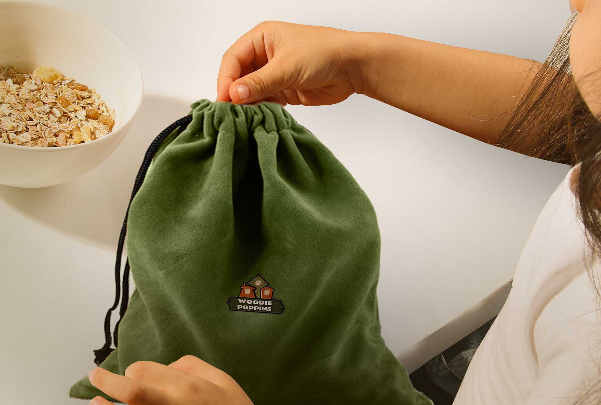
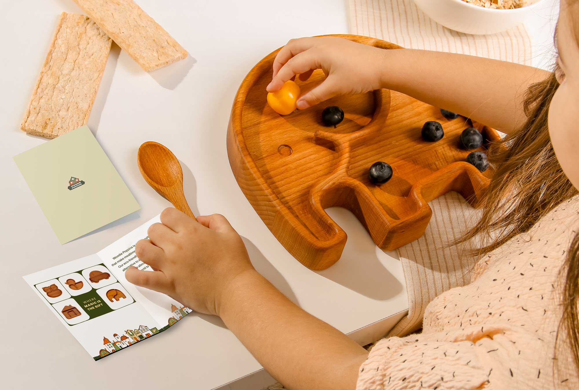
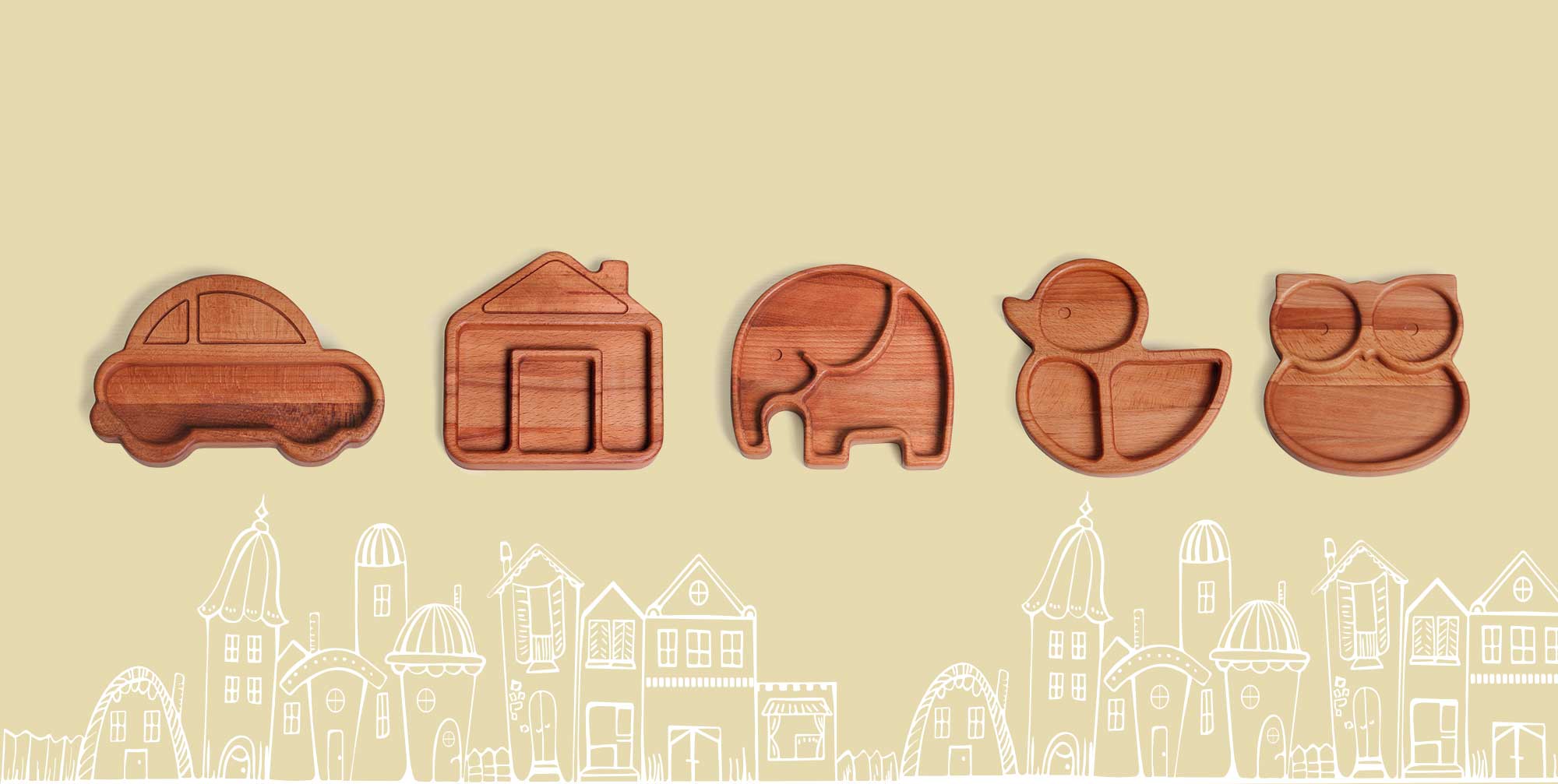
Woodie Poppins produces a variety of ecologically clean and safe utensils made from natural beechwood. Eco-friendly wooden products are a good alternative to silicone and plastic tableware.
-
DELIVERABLES
BRANDING
NAME AND BRAND SLOGAN
LABEL DESIGN
PACKAGING DESIGN
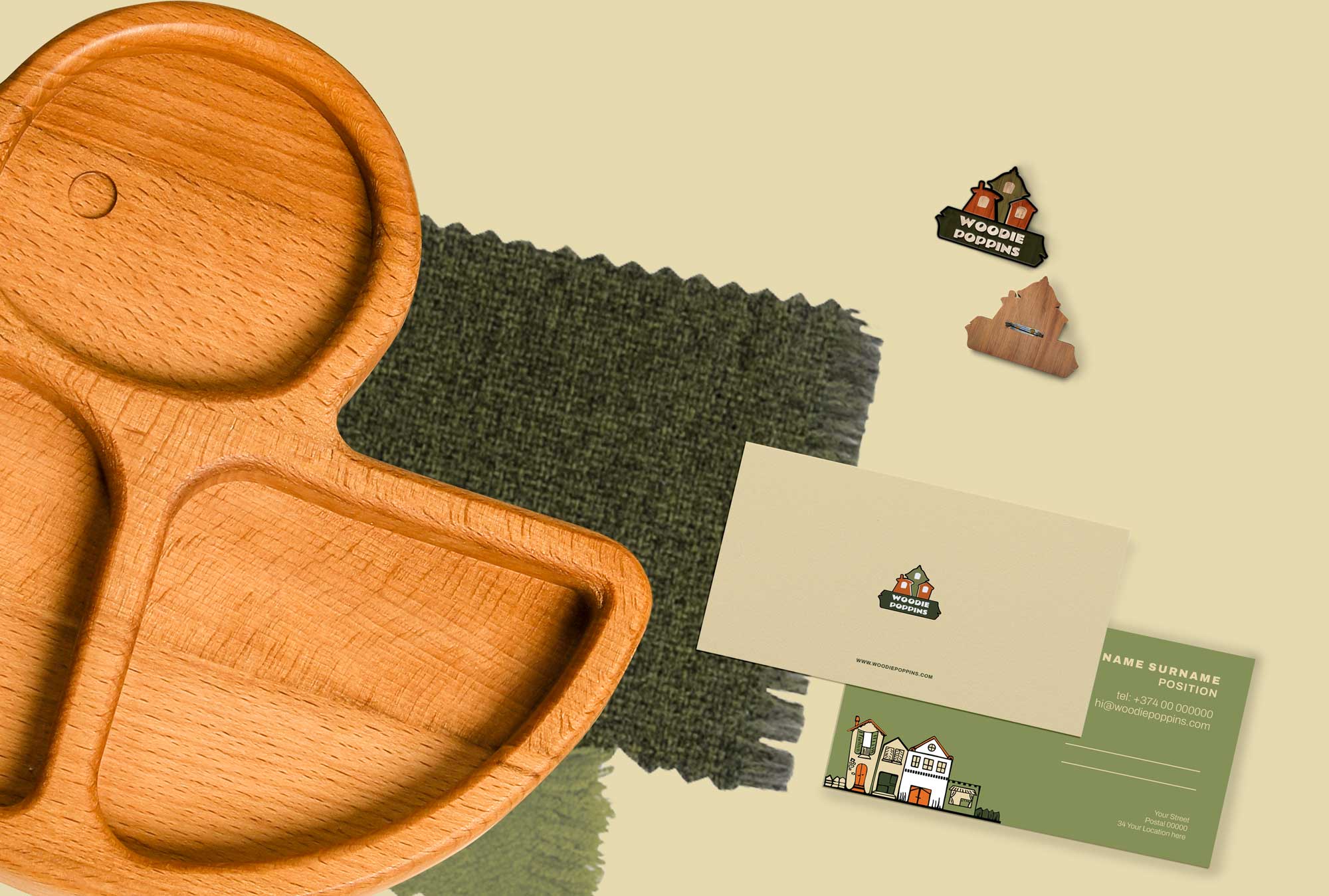
DESIGN MATERIALS
-
CLIENT
-
To create a brand platform, we researched and analyzed the company's marketing goals, as well as conducted an analysis of the market and competitors. As a result, we have developed a brand name, slogan, visual and verbal identity.
The research and workshops built up the fundament for branding, with the main focus on brand values - purity, care, love, and safety. Based on the brand strategy and platform, we also created the concept, name, and story behind the Woodie Poppins brand.
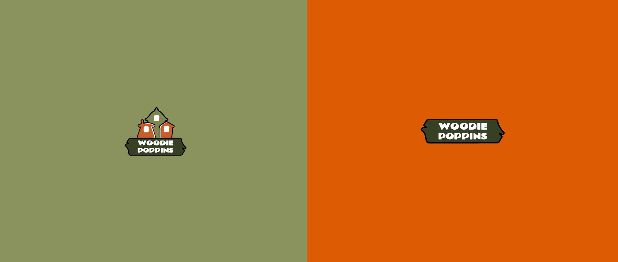
The following priorities were established throughout the development process: develop a name that will reflect the value system and vision of the brand and will be perceived in the international market. As a result, we chose the name Woodie Poppins, which represents the type of product, and is also associated with the caring character of Mary Poppins.

The brand slogan "Where magic is the gift" is based on the joy of a miracle and receiving a gift.
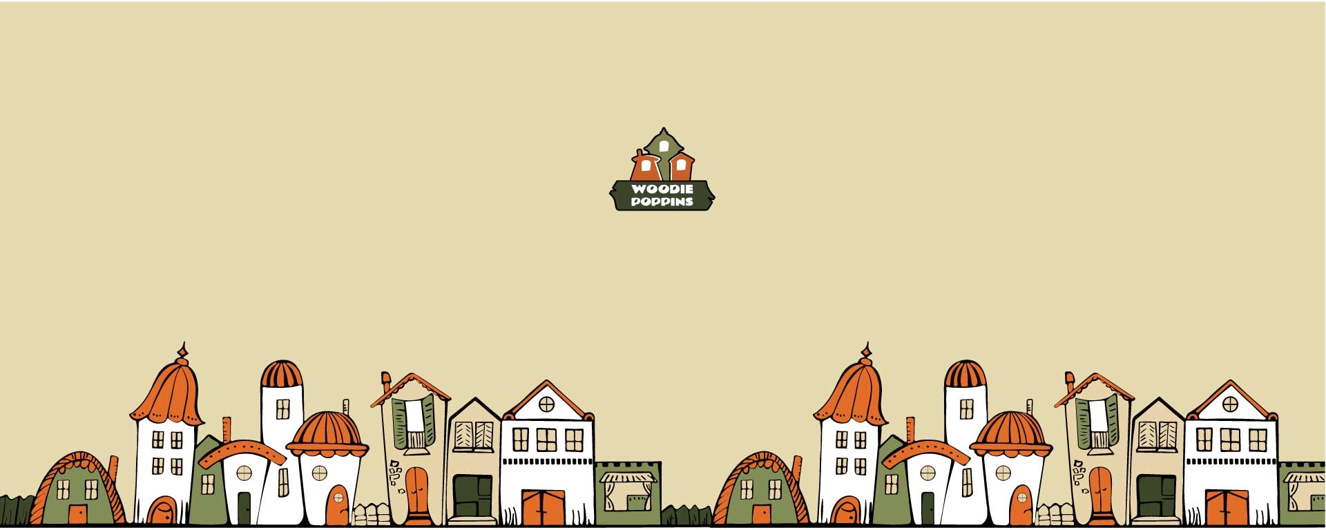
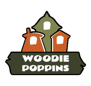
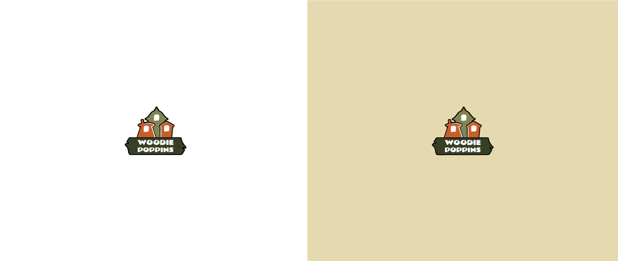
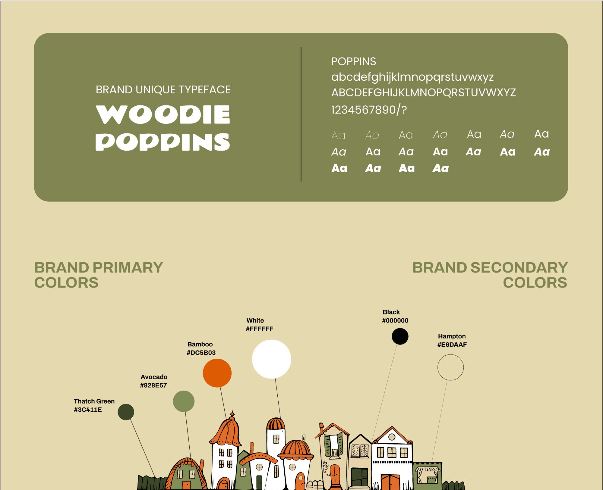
Having in mind the brand platform and inspired by the brand story and promise to produce only environmentally friendly products, we created the brand logo. The design team chose the brand palette, consisting of Dark Green, Light Green, Orange, and White primary colors and Black and Cream secondary colors. The green colors give the eco feeling of the brand, the orange gives the warmth of the family. White is balancing all of the colors.
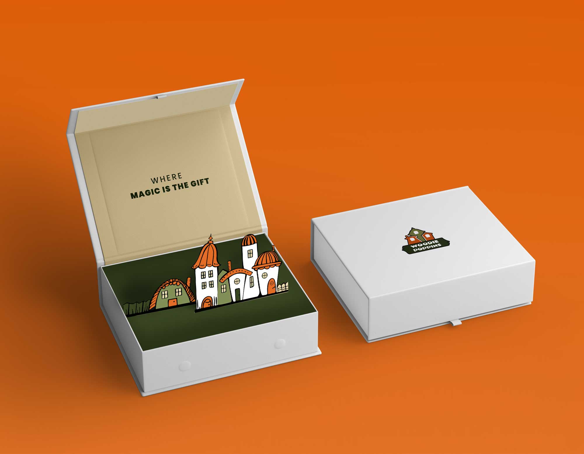
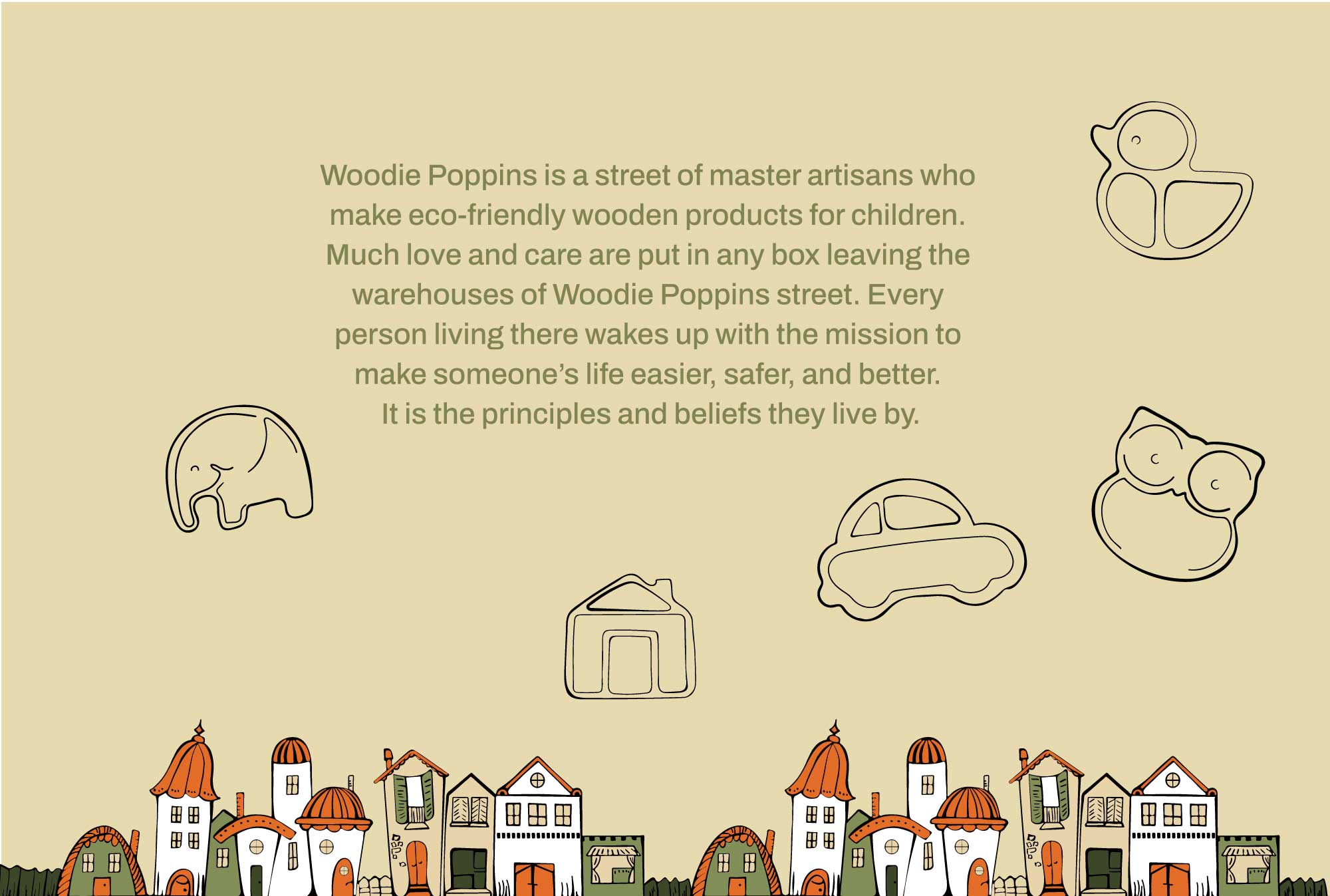
Three wooden houses show the idea of Woodie Poppins Street, where master artisans make eco-friendly wooden products for children. Much love and care are put in any box leaving the warehouses of Woodie Poppins street. Every person living there wakes up with the mission to make someone's life easier, safer, and better.