-
NOURISH BRANDING
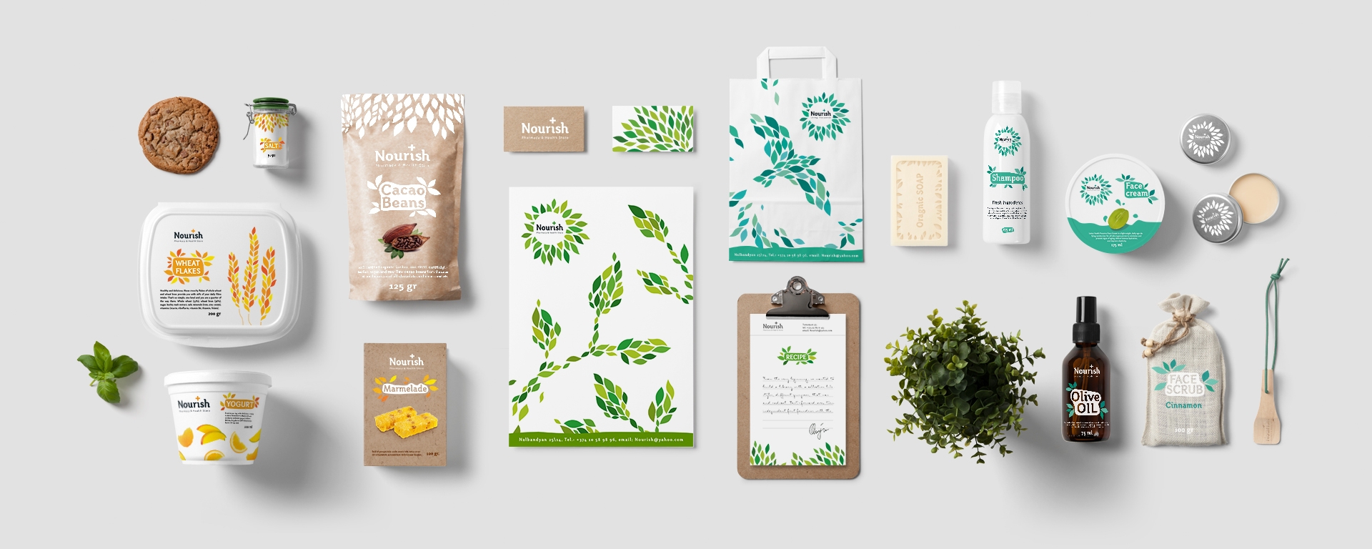
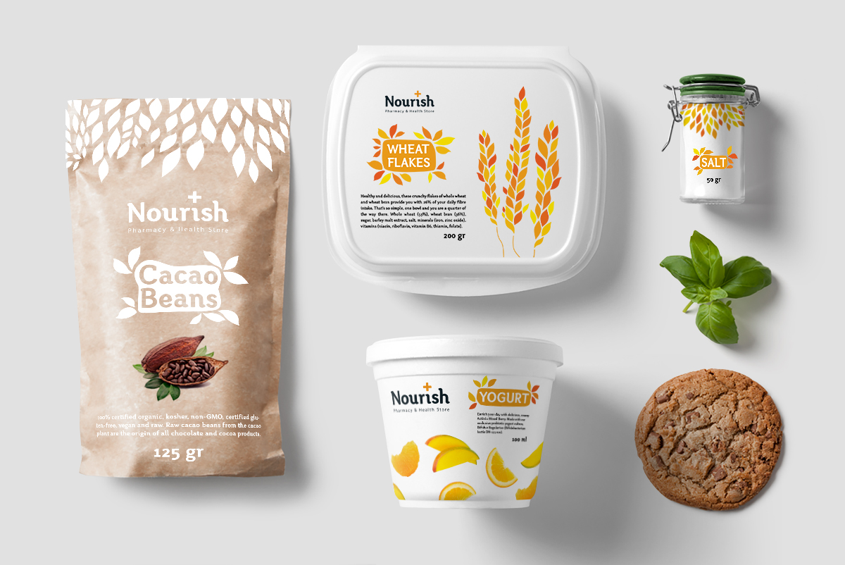
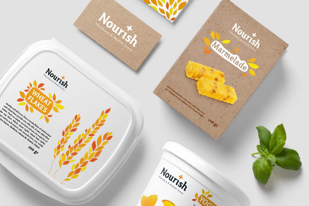
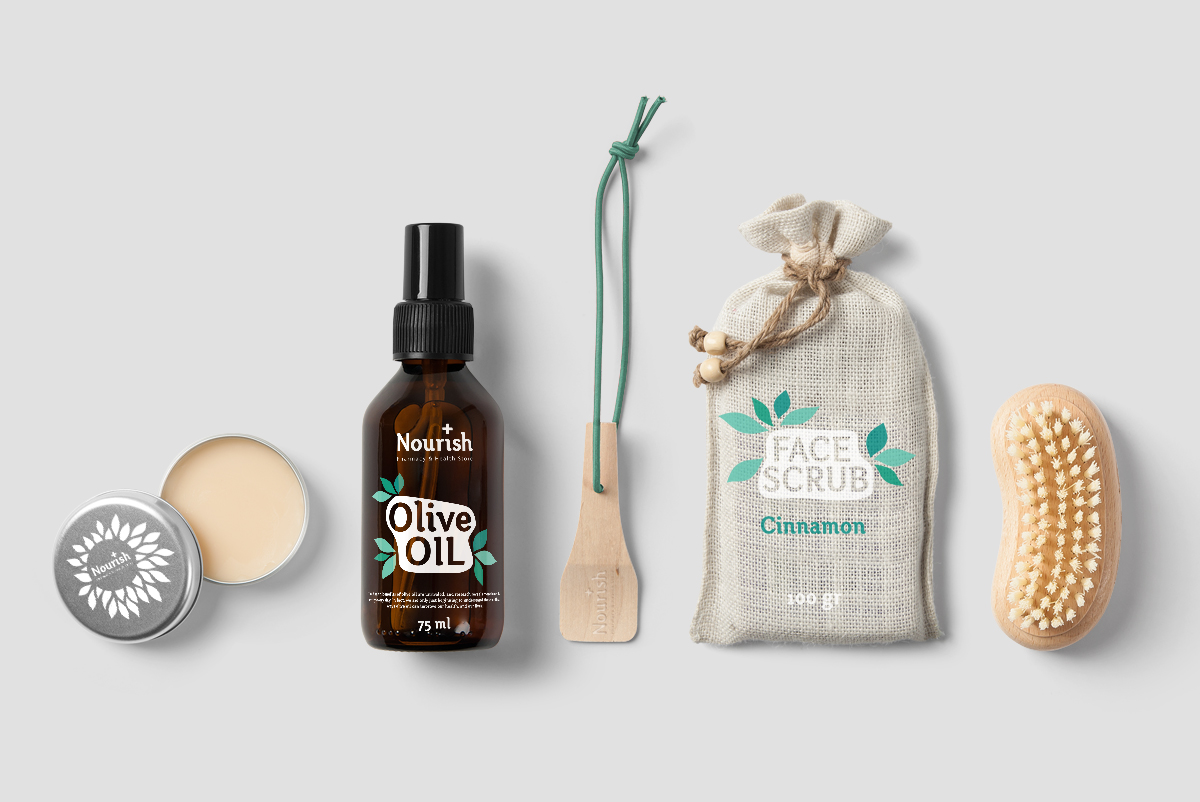
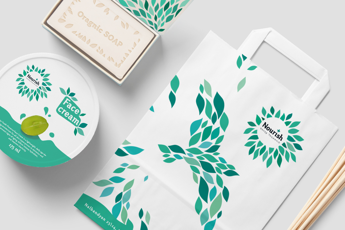
"Nourish" is a drugstore with completely new format, where one can buy either medicine or organic food and body care. In this store every client is being taken care of individually and receives high quality assistance.
-
DELIVERABLES
CORPORATE IDENTITY
-
CLIENT
-
CORPORATE IDENTITY
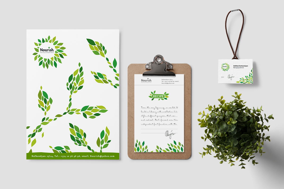
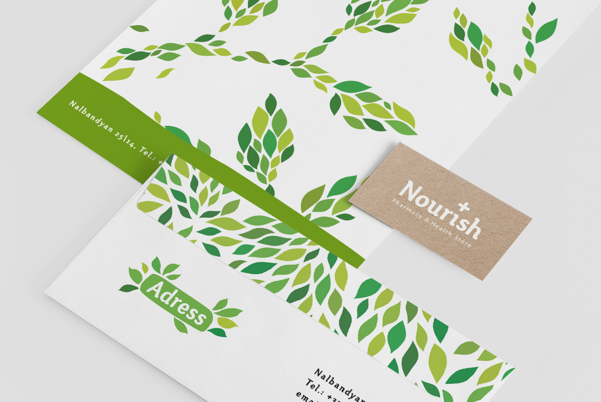
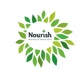
While developing the brand, first step was to create a name. Nourish means to provide with the food or other substances necessary for growth, health, and good condition. Then we proceeded with creation of the logo and corporate identity. The logo is in a form of sun that has an irregular shape. The sun always stretches its rays out, thus, healing and nourishing people with its warmth. To highlight the connection between "Nourish" and nature we have chosen the color green, and to expose the diversity of the brand we have chosen turquoise and orange.


